AVAILABLE 24x7
888.662.2724
AVAILABLE 24x7
(888) 66CARAH
Fast & Accurate
Request A Quote

Quick Response
Chat With Us



 Colors



Colors
This section outlines the official Carahsoft color palette and provides guidance on proper usage across digital and print materials. It also defines best practices for color contrast, including clear do’s and don’ts, to ensure accessibility, readability, and visual consistency in every application of the brand.
Primary Colors
Carahsoft Blue
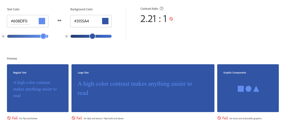
HEX: #3155A4
RGB: 49 | 85 | 165
CMYK: 91 | 75 | 1 | 0
Pantone (PMS): 286U
Background Blue
HEX: #D1E7FF
RGB: 209 | 231 | 255
Big Bets Blue
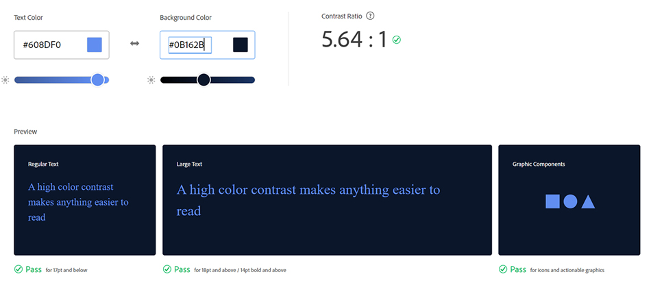
HEX: #608DF0
RGB: 96 | 141 | 240
Deep Blue Quotes
HEX: #20376A
RGB: 32 | 55 | 106
September Night
HEX: #0B162B
RGB: 11 | 22 | 43
Neutral Colors
Links Court
HEX: #F6F7F8
RGB: 246 | 247 | 248
Silver Line
HEX: #CCCCCB
RGB: 204 | 204 | 203
Toll Road
HEX: #808080
RGB: 128 | 128 | 128
Accent Colors
Montego Bay
HEX: #52DFFF
RGB: 82 | 223 | 255
Web Accessibility
Accessibility ensures that essential color contrast standards are met so all users can clearly read and engage with the information we provide. Designing with accessibility in mind supports inclusivity, usability, and compliance across digital experiences.
Big Bets Blue on September Night passes the contrast test.
Big Bets Blue on Carahsoft Blue does not pass the contrast test.